The Approach
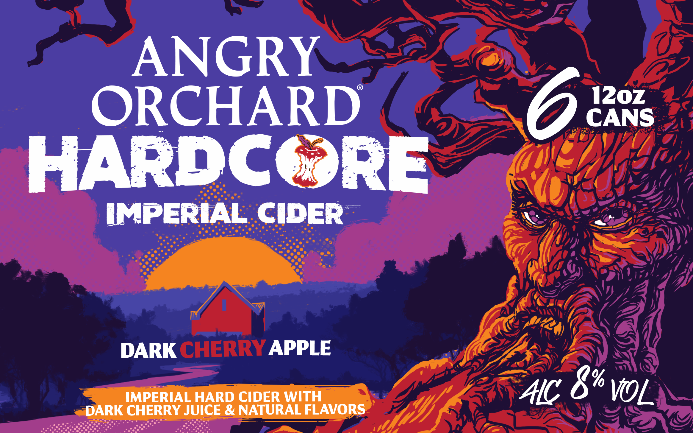
Lightening up the packaging, making sure that it's recognizeable as an Angry Orchard product, while incorporating the new tree illustration
Along with making the brand recognizeable, another designer on the Angry Orchard team re-interpreted the iconic tree, illustrating it in a more graphic style. We incorporated these two things together, along with the Dark Cherry Apple flavor notes to develop the new packaging.
The Story
Angry Orchard Hardcore brings the classic cider to a new level, with 8% ABV and delicious dark cherry apple flavor.
Settling on a dusk-like color palette, the Angry Orchard team decided that a red tree would visually define the Hardcore sub-brand. I am so thankful to have worked with an incredible team to teach me so much about packaging design, walking me through the whole process.


